Datte-Moi
Brand identity and packaging for a new Québec-based date distributor.
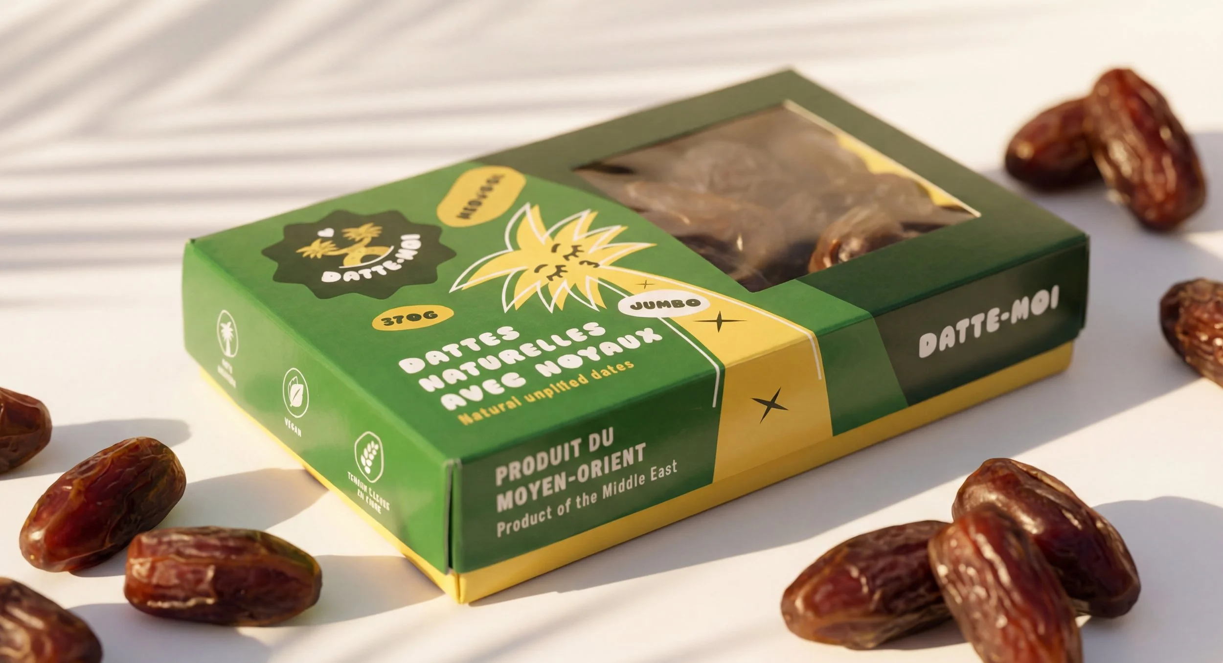
Datte-Moi is a new Québec-based distributor of natural dates imported directly from the Middle East, launched in 2024. The brand was built from the ground up around a playful bilingual wordplay: "Datte-moi" sounds like "date me" in French, turning a simple pantry product into something warmer and more emotionally charged. The goal was to take dates out of their usual visual territory and reintroduce them to a local audience with a brand that feels approachable, modern, and a little flirty.
Solo creative mandate. Brand identity, illustrations, typography, color system, and packaging. Developed through La Grappe.
-
Dates are deeply tied to Middle Eastern visual culture, which usually comes through in packaging via calligraphic references, traditional patterns, and earthy color palettes. Beautiful, but easy to tune out on a Québec grocery shelf. The brief was to honor the origin of the product without relying on those codes, and to build an identity that speaks directly to a local audience. The wordplay in the name was the starting point. Everything else had to live up to it : a brand that felt as playful, warm, and effortless as the phrase "date me."
-
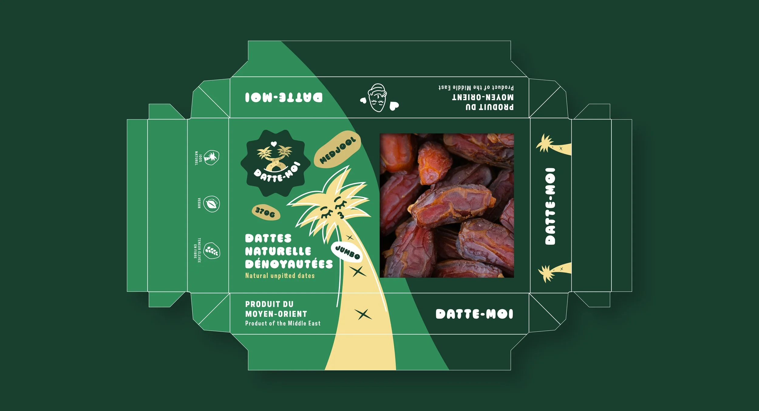
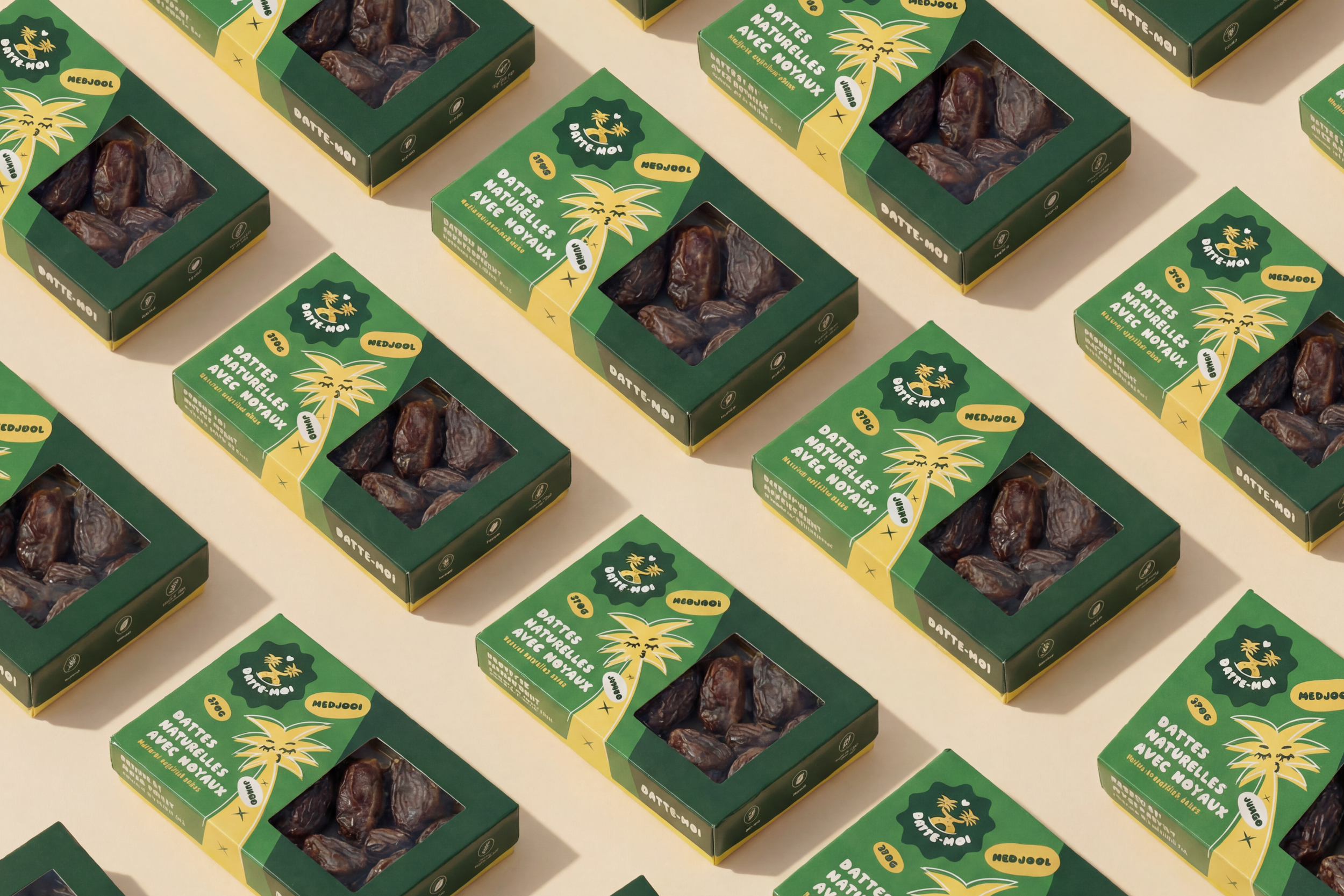
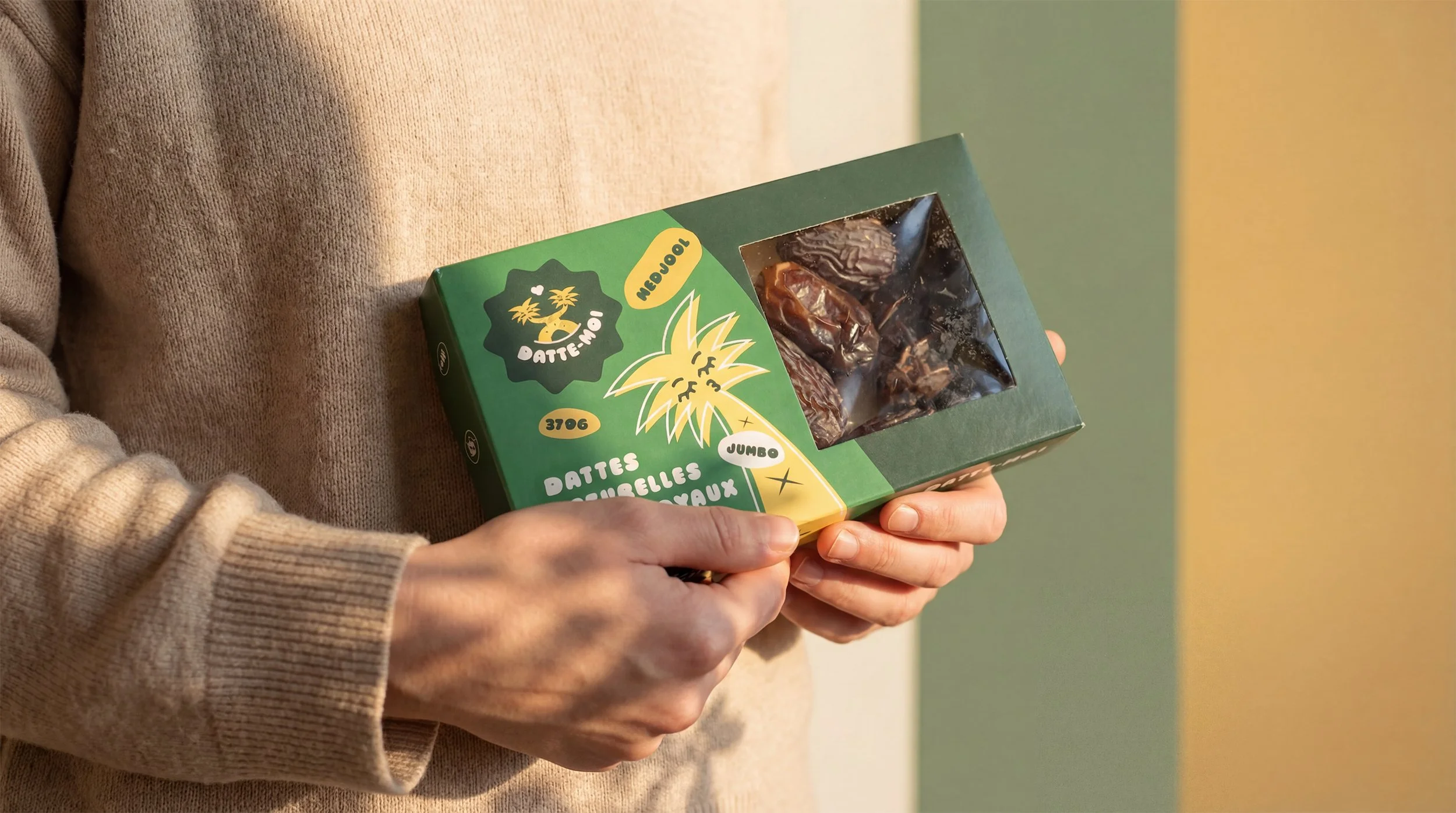
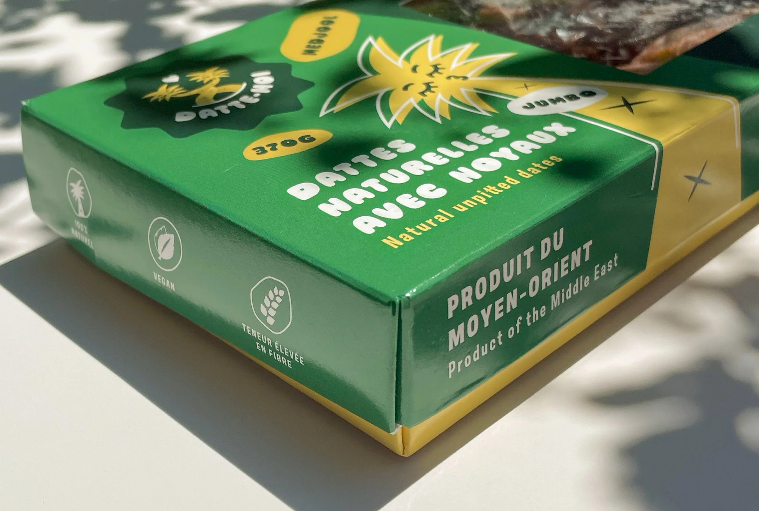
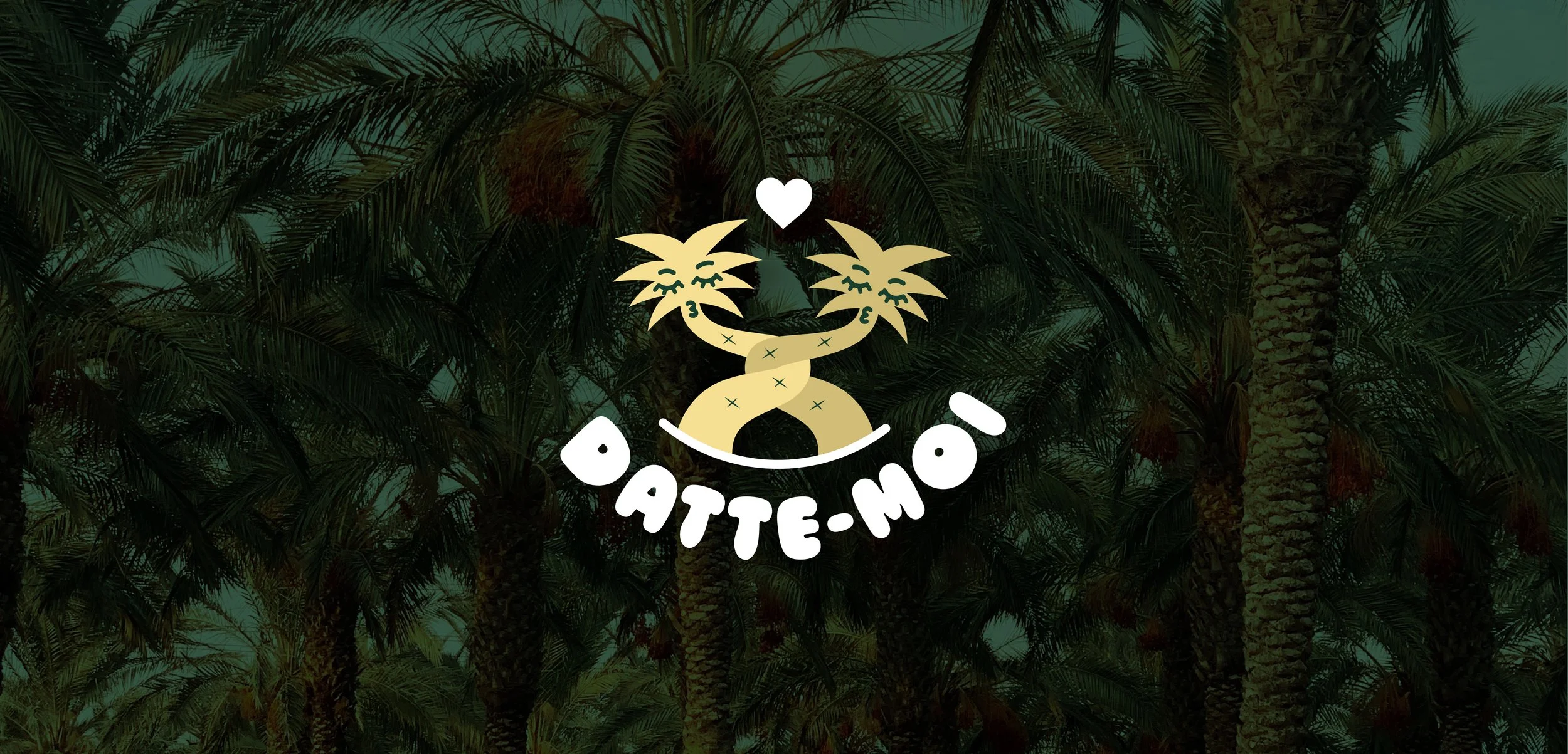
The concept is built around connection and attraction. The logo features two date palms leaning toward each other, a simple and unexpected visual that translates the wordplay into form. The two trees mirror the idea of a first date, meeting, or flirtation, and anchor the brand with a symbol that is both warm and quietly clever. Around the logo, the identity uses soft, confident typography and a color palette that borrows from the fruit itself : deep caramel, sun-warmed neutrals, and a touch of rose for contrast. The overall tone is inviting rather than exotic, placing Datte-Moi firmly in the conversation of modern everyday brands.
-
The visual system was developed end to end : logo, typographic system, color palette, graphic elements, illustrations, and packaging. The packaging was designed to be distinctive on shelf while remaining flexible across formats, with a visual hierarchy that lets the wordplay and the logo carry the brand identity at a glance. An explanatory brochure was also developed to accompany the launch, introducing the product and its origins to Québec consumers.