Origine
Brand identity for a Québec agrotourism and local food platform.
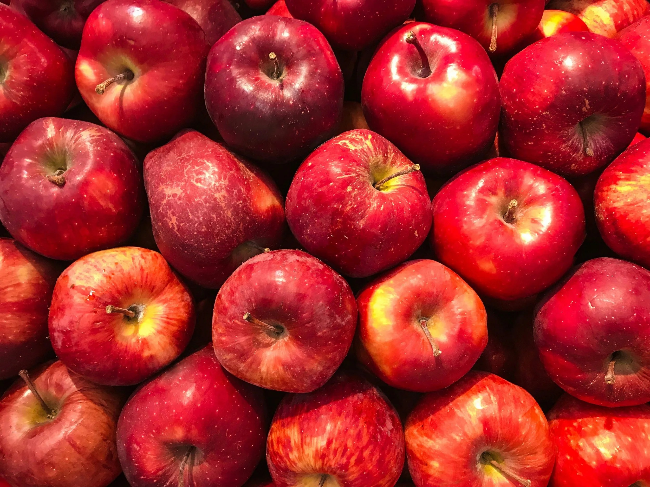
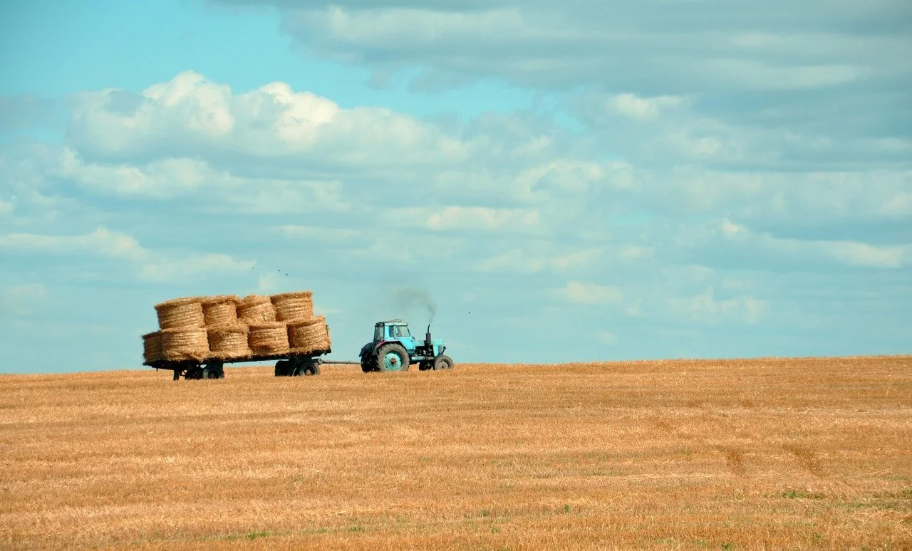
Origine is a Québec-based platform connecting people to local agriculture through three offerings: an online shop featuring artisanal producers, signature agrotourism tours across the province, and an editorial magazine on the terroir. The project required a visual identity that could hold all of it together without falling into the usual agrifood clichés.
Solo project. Brand concept, identity design, typography, and visual system.
-
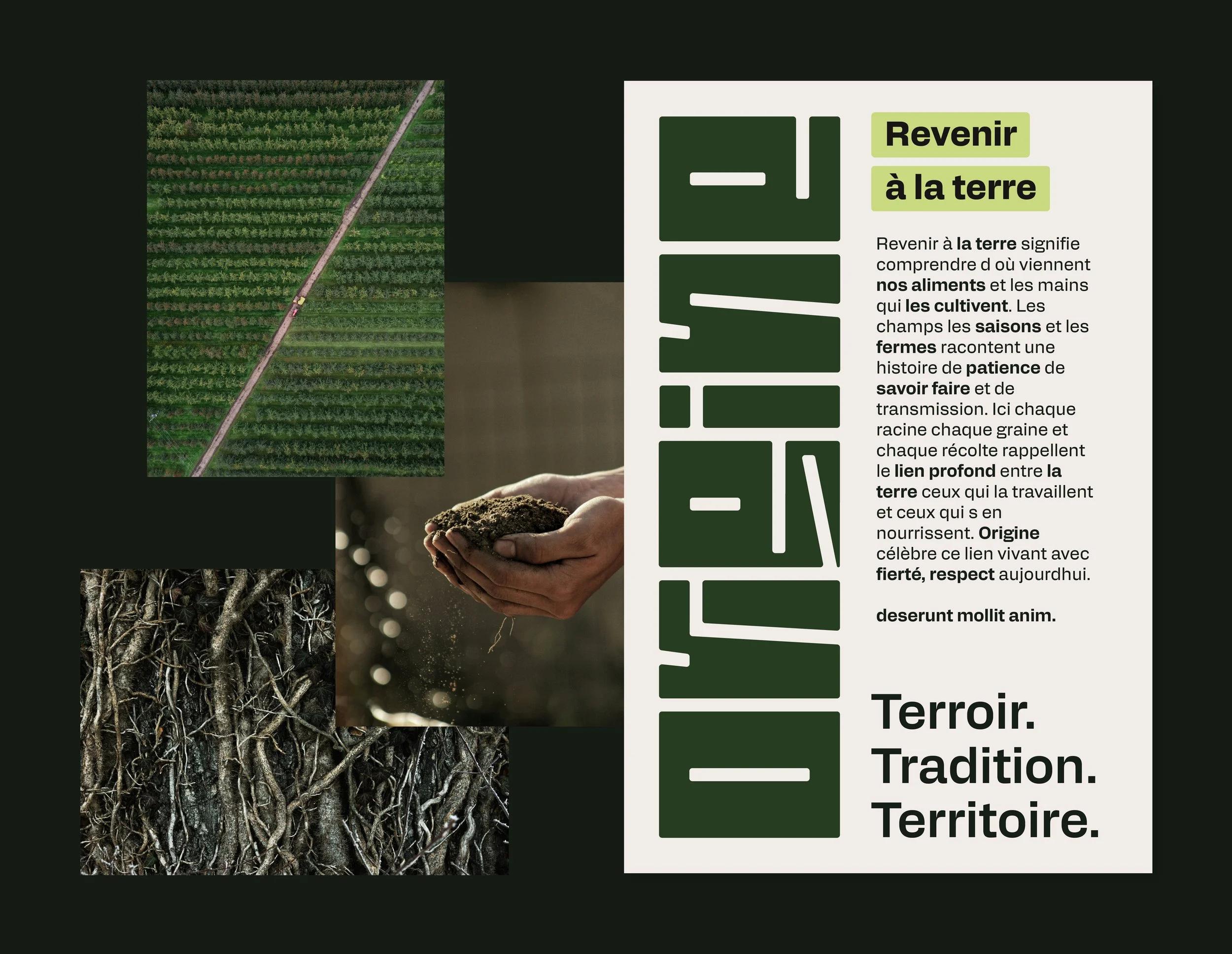
The client came in with a clear vision of what they did, but no direction yet for how it should look. We started with mood boards to map out possible territories and land on one that felt right. The main tension was clear early on : Québec agrifood branding leans heavily on the same visual codes, and going there would make Origine blend into a crowded category. The approach was to build the identity around typography rather than imagery, letting the letterforms themselves carry the meaning instead of relying on literal depictions of the land.
-
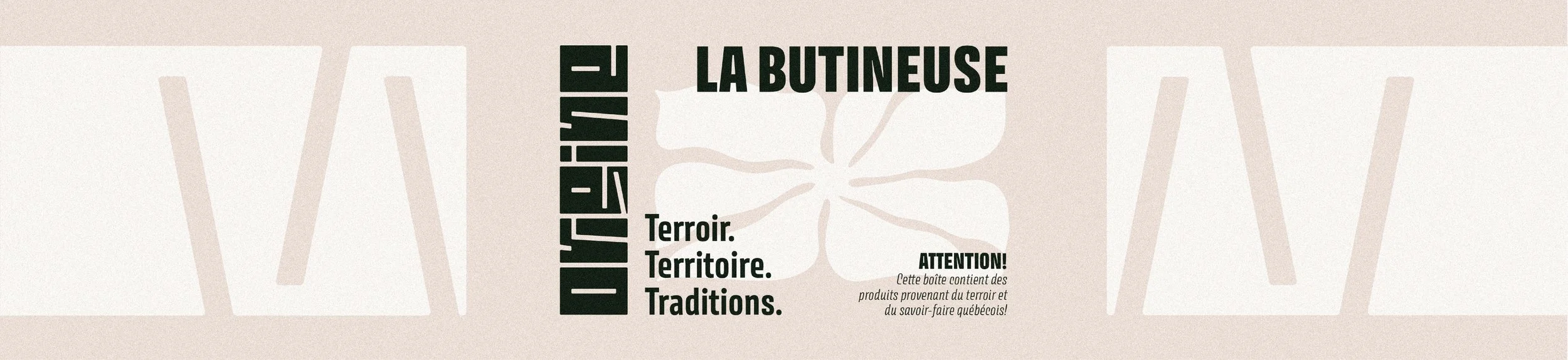
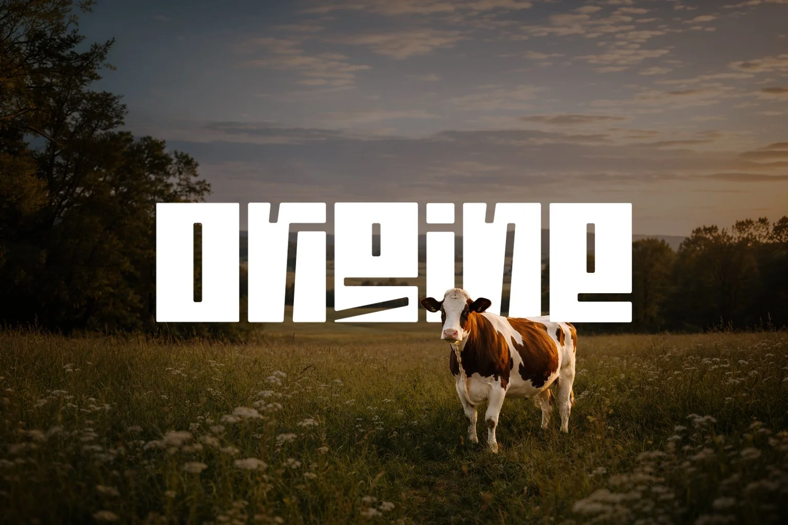
The concept centers on roots and connection to the land. Bold wordmarks represent the soil, while the negative space between the letters forms a system of roots growing underneath. This interplay between solid and empty, surface and underground, is built directly into the structure of the type. It keeps the brand grounded in its subject without falling into the expected imagery of the category.
-
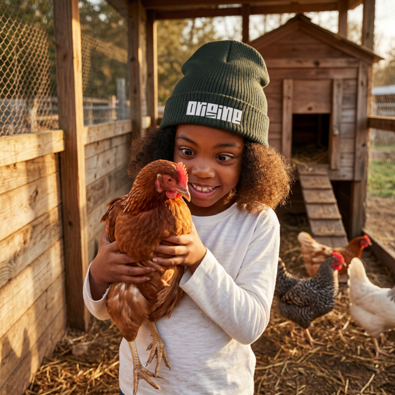
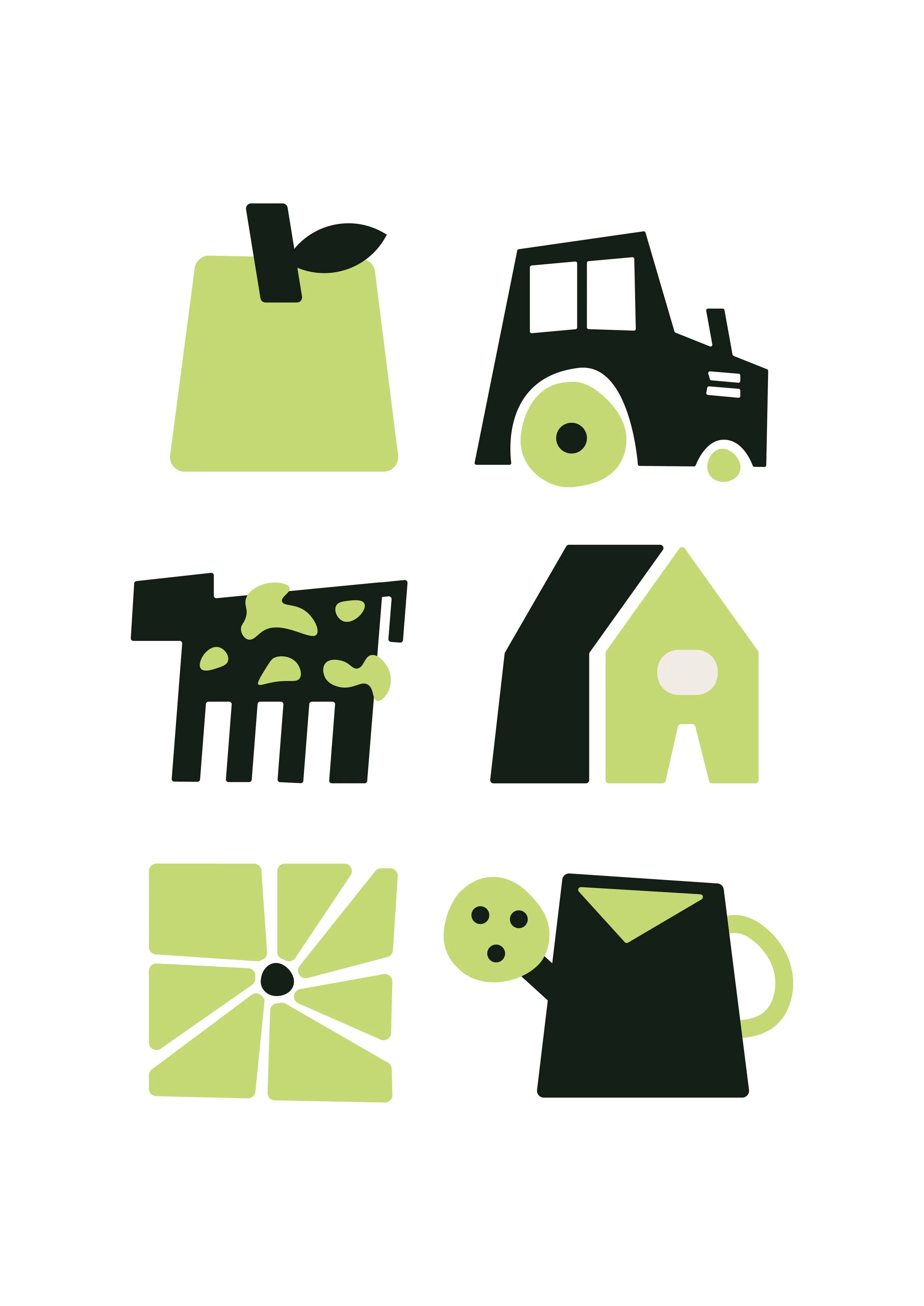
The visual system extends the typographic concept into a full visual language. Structured layouts echo the solidity of the land, while generous spacing introduces a sense of openness and flow. A restrained set of graphic elements, carefully paired imagery, and a clear typographic hierarchy let the identity flex across very different touchpoints, from product packaging on the shop side to editorial layouts for the magazine to signage for the agrotourism tours. Final deliverables included the logo, full brand guidelines, color system, typographic system, and iconography.