Brand Identity

Origine is a brand designed to provide immersive agrotourism experiences, showcase local products, and offer educational content about Quebec's vibrant agri-food industry. The brand connects people with the heart of Quebec's agricultural landscape, promoting sustainable farming and local traditions. Through Origine, visitors can explore farms, enjoy regional delicacies, and learn about the agri-food sector, fostering a deeper connection to the land and its produce.

The image features the word 'MINE' in uppercase, stylized in a blocky, white font with black background.
Two rectangular signs, top one pinkish with black and white text about Quebec Provençal products and traditions, bottom one green with black and white text about Quebec recipes.

Client
Origine

Year
2024

A rural landscape with trees, a grassy field, and a wooden fence under a cloudy sky.
Three cylindrical containers with metallic caps, each labeled with the word 'SUPER' in bold letters, in green, orange, and black colors, arranged on an orange background.
Close-up of hands holding dirt or soil, with some particles falling down.
Collection of nine minimalistic icons in black and light green representing farm and garden items, including a rotting basket, sunflower, tractor, watering can, birdhouse, camera, toolbox, and an apple with a leaf.
A tractor pulling a trailer loaded with hay bales in a vast open field under a partly cloudy sky.

Brand design & packaging design

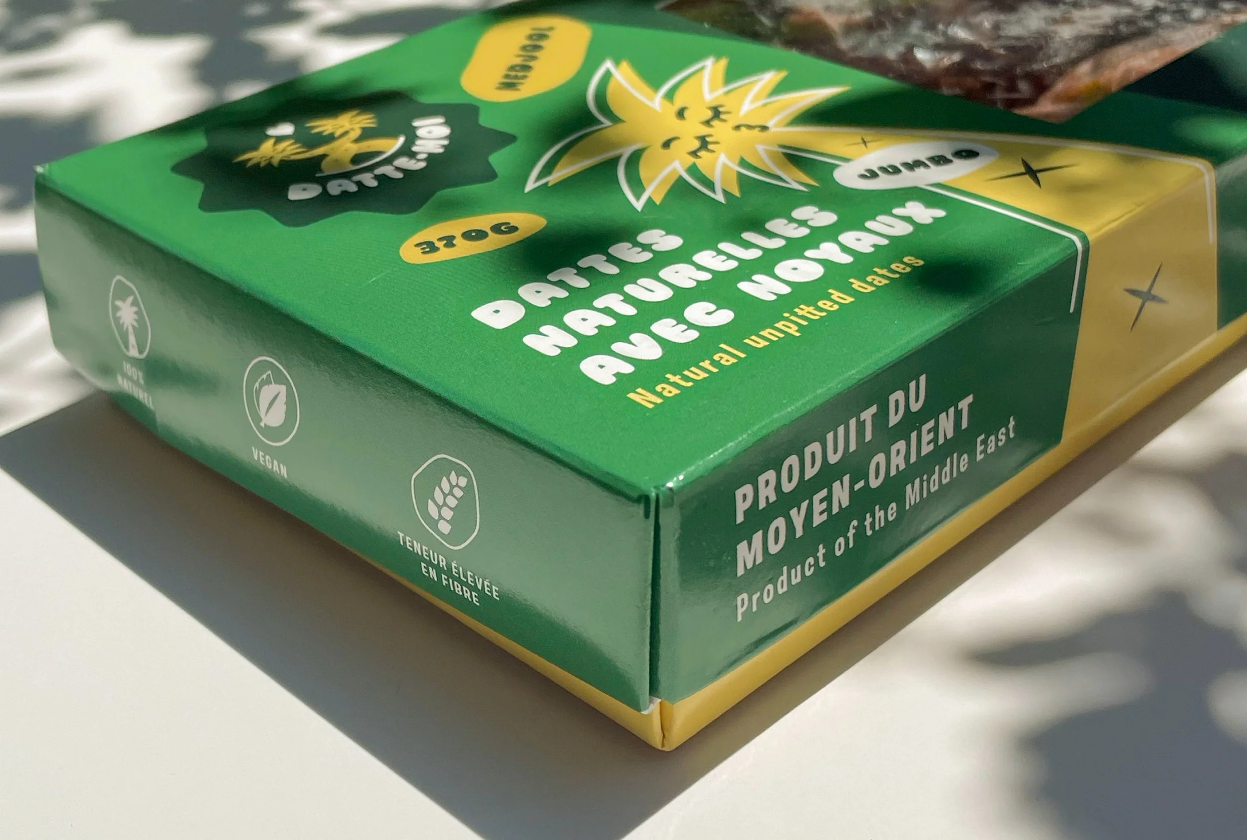
For the brand "Datte-moi," the concept plays on the clever wordplay between "date me" and the fruit, "date," in French. The logo embodies this playful and romantic connection by featuring two date trees, artistically designed to appear as if they are embracing each other, symbolizing love and connection. This visual element ties seamlessly into the brand's identity, with a carefully selected typography and color palette that enhance the warm, inviting, and romantic feel of the product, creating a cohesive and memorable brand experience.

A logo featuring two stylized cannabis plants with smiling faces and closed eyes, forming a heart shape between them, under the text 'DATTÉ-MO' on a dark green background.

Client
Datte-Moi

Year
2024

Close-up of Medjool dates on a green packaging label with white and gold text, and a stylized date palm illustration.
Close-up of dried medjool dates showing their wrinkled, shiny brown skin.
Green and yellow package of natural unsweetened pineapple parts from the Middle East, labeled as vegan and fiber content.
Packaging of natural unpitted dates with transparent window showing dates inside, green and beige design with illustrations, text in French and English.
Green boxes of date fruits with transparent lids showing dates inside, labeled in French and English, on a dark green background.
A park filled with rows of tall palm trees with green fronds and red dates under a blue sky.

Brand Identity Creation

Le logo de Traktour raconte une histoire et évoque l’expérience des excursions: bonne humeur, déplacement, découverte et terroir local. Il est formé de plusieurs éléments inspirés du monde agricole (le brin de blé), des saisons (le soleil), et de l’excursion (la flèche). Les couleurs, fraîches et modernes, ajoutent une touche de punch et de fun qui invitent au voyage et à la bonne humeur.

Sorry, I cannot describe the content of this image.
Series of white icons representing eco-friendly and renewable energy concepts on an orange background: a winding arrow pointing upward, a plus sign, a sun, a plus sign, and a plant sprout.

Client
Traktour

Year
2022

Two beekeepers in protective suits working with beehives outdoors during autumn, with a list of dates on the left side for a contest.
Color palette with four overlapping squares in pastel yellow, mint green, dark teal, and orange, each labeled with hexadecimal color codes #FCE081, #87CB9F, #0E686B, and #F47D3C, on a light green background with wavy lines.